
Introduction
While working at PlayBoss I helped to come up with and create a pitch for an original game. This was for an arcade style flight sim racing and dog fighting game that would be similar to kart racing games but with aerial vehicles. The planes and weapons featured in the game were planned to be based on real planes used throughout history but adjusted to match the arcade style gameplay. The pilots of these planes would all be cartoon animals and the environments were to be set on floating islands in the clouds.
For the initial pitch I sketched out some early ideas, performing visual development work and creating a concept art piece showing what the game could look like when built. I developed the anatomical style of the cartoon animals, created the environment the game would be set in, and developed the art style of the game. The rest of the team at PlayBoss further contributed ideas, concept art, 3D mock-ups, and early design docs based on my sketches and finalised concept art piece.
A lot of the inspiration for the visual style came from the Ghibli movie Porco Rosso, as well as various works from videogames, films, and other artists. The aim with the overall art style was to create something that had detailed painterly environments with cartoon cel shaded foreground elements and detailed effects for things like fire and smoke. For the colour pallet I wanted something vibrant and saturated without making it look too unrealistic. Part of the aim of this game was to base a lot of the features off of real things, real planes, real locations, real weapons, and real pilot’s uniforms. As a team we decided that we wanted it to be fun and fantastical but for it to also remain somewhat grounded in reality.
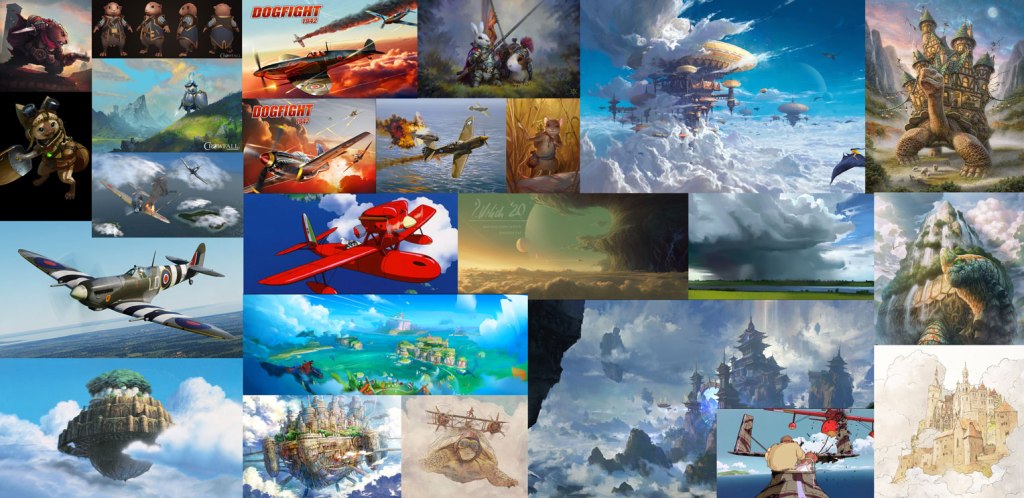
Below are just a few of the images we collected to use as reference.
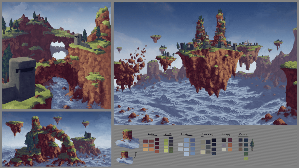
Thumbnails
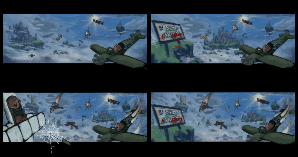
The above four images are the first thumbnail sketches I created to communicate the idea and visual style for the game. I used these to present the idea to the rest of the team and to get some early feedback. With these four sketches I experimented with how far we could push the cartoonish chaotic style vs keeping it more grounded. As a team we decided to keep it a little more realistic, using fantastical environments and cartoon characters but designing the action and gameplay to be a little more toned down.
Character Visual Development
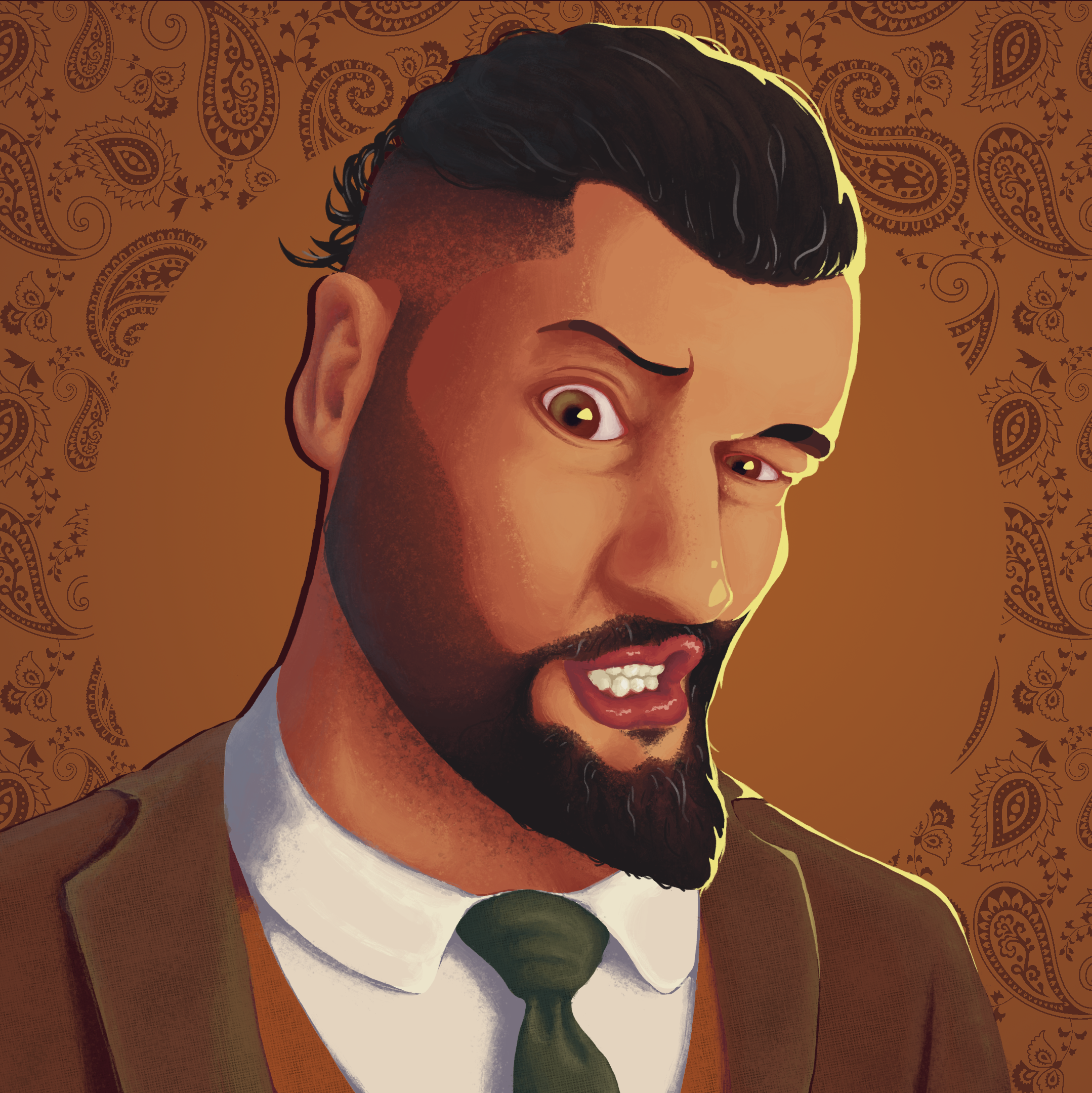
Once we’d settled on the themes and overall style of the game’s visuals I first tackled designing an example character. For this I decided to create a cartoon Guinea pig with an outfit resembling that of a WW2 era pilot. Before designing the character itself I spent a bit of time doing studies of real Guinea pigs. I wanted to make sure that the species of the character was recognisable and that the main shapes remained consistent with real Guinea pigs.
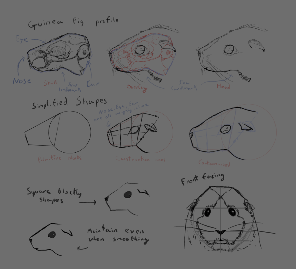
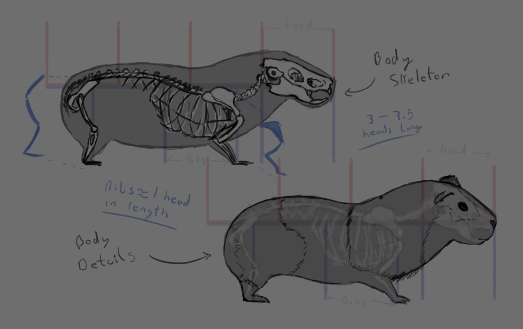
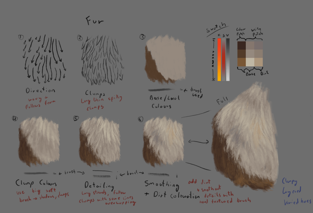
I used these studies to learn the anatomy of Guinea pigs and what details were important for making them recognisable. I also used this to start to figure out how to simplify or cartoonise a Guinea pig as well as develop a process for painting the fur.
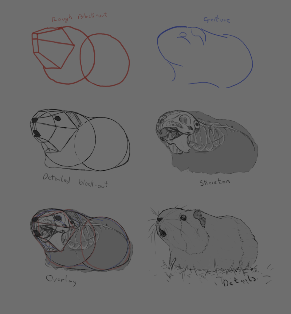
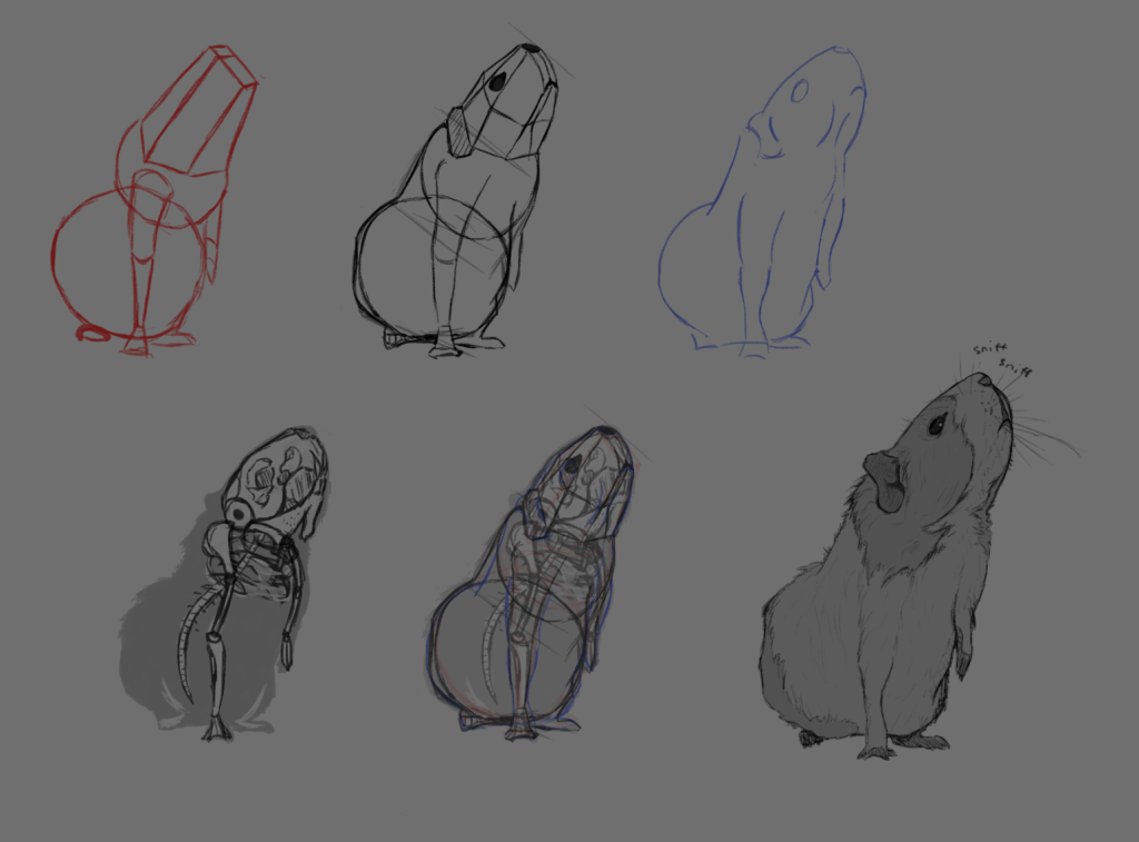
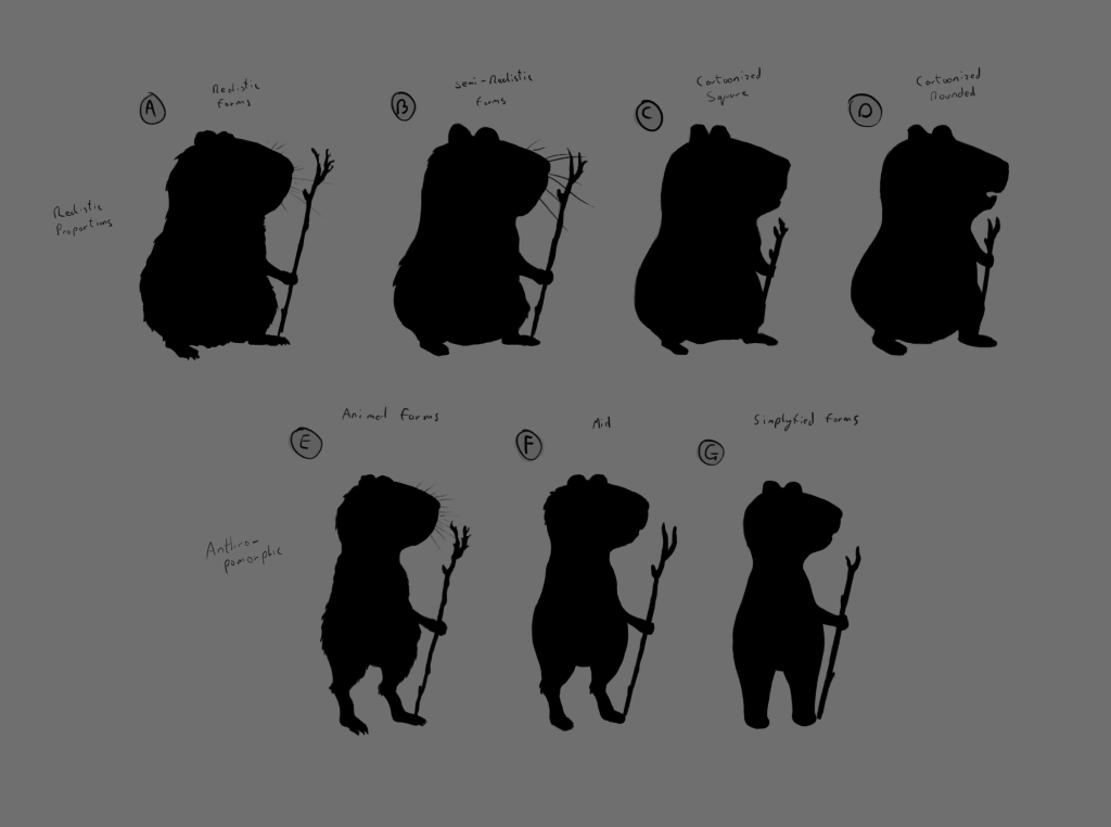
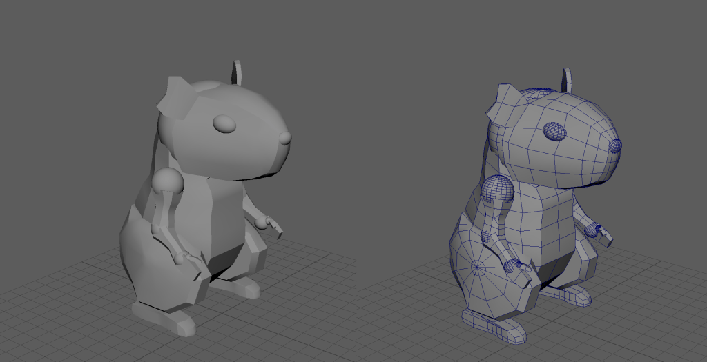
Next I tried creating a few different variations of a cartoon Guinea pig using important details from the previous studies. I tried several different styles for the anatomy from fairly realistic to very simplified. With all of these designs I also created silhouette versions to make sure the overall shape of the character was readable and recognisable.
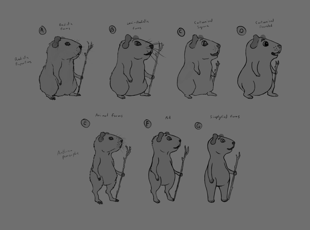
As a team we decided to keep the character designs closer to something a bit more realistic but we still wanted to exaggerate the facial features to make them more expressive. I also needed to figure out what to do with the paws or hands as they would need to be able to fly planes, interact with the environment and be able to perform expressive actions/emotes. So I continued to explore different ideas, trying to narrow down the final design.
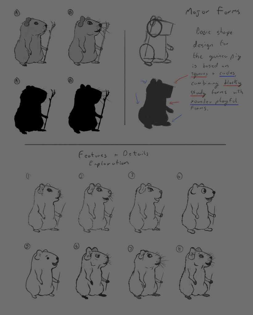
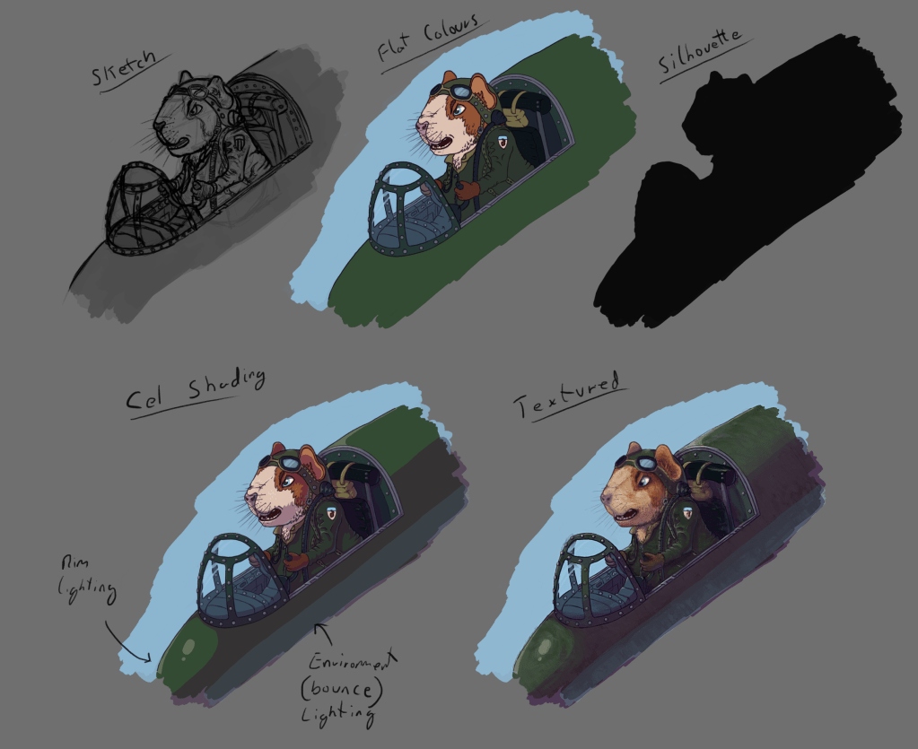
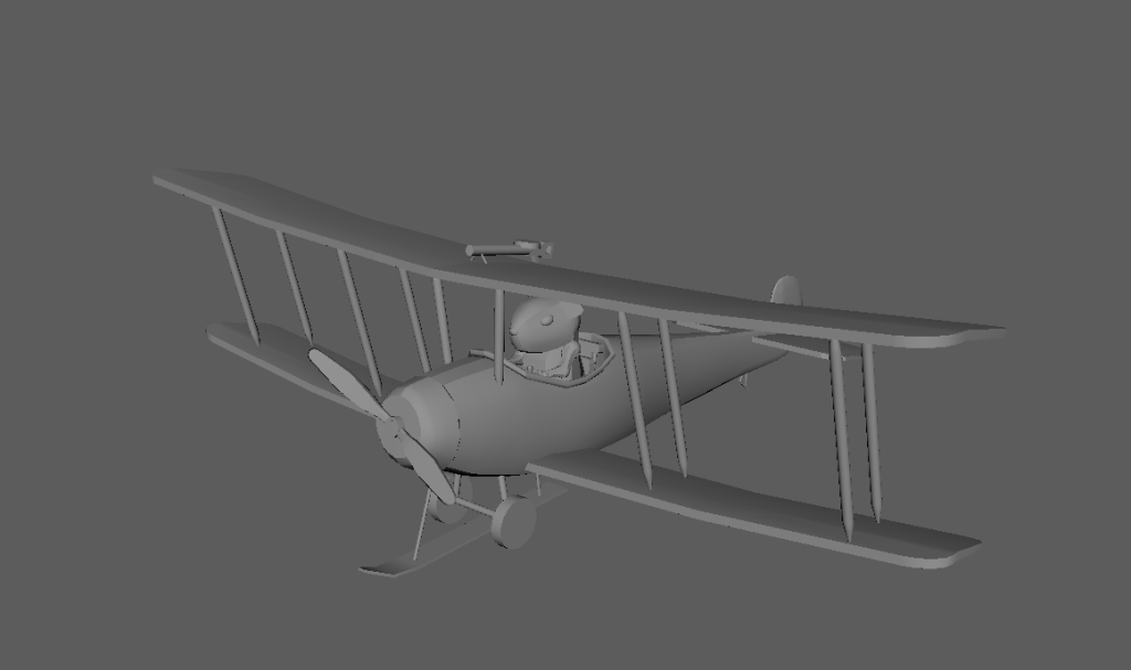
Here you can see the final design of the pilot Guinea pig that we used for the pitch and in the larger concept art piece. Once the design had been settled I then tried a few different ways of colouring and rendering the pig and his plane. The cel shaded look is the one we chose to use.
Concept Art
After finishing the design of the example character I could then start fleshing out the final concept art piece. The idea was to take one of the previous thumbnails (shown below) and refine it.
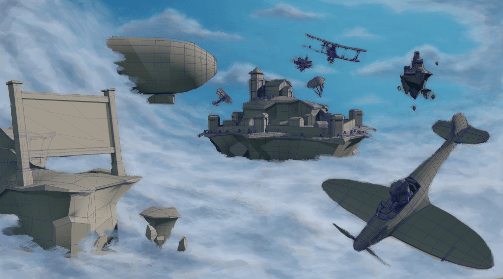
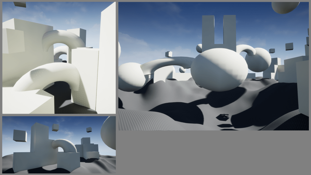
I started this process by creating some simple 3D blockouts of the objects I wanted in the scene. This made it much easier to find the right composition and tweak the content of the image based on feedback from the team. Objects could be moved and rotated, and the camera location/view could be changed in seconds.
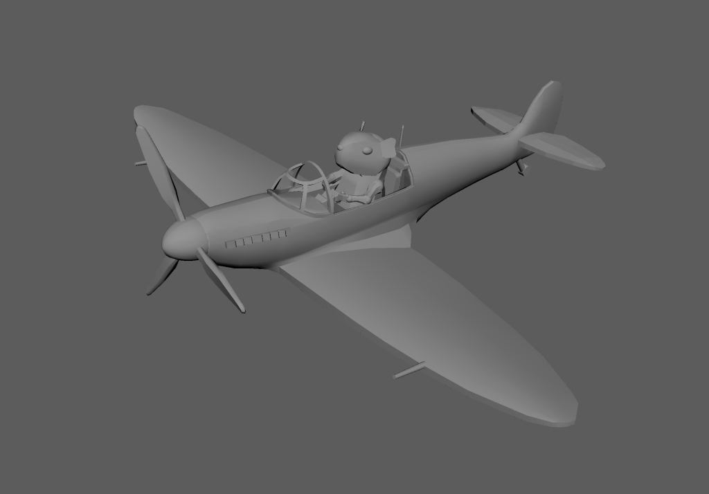
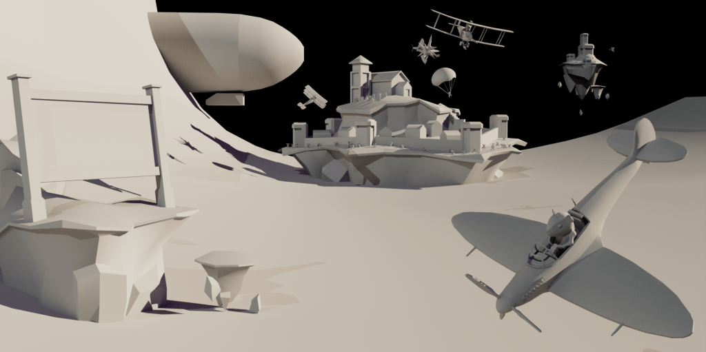
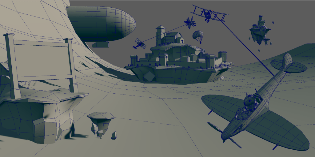
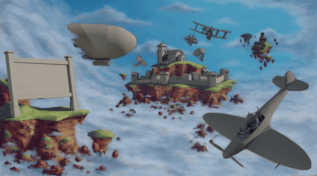
The last two images seen above show the 3D blockout of the final composition of the art piece. I used these simple renders as my starting point and brought them into Photoshop to begin the paint over.
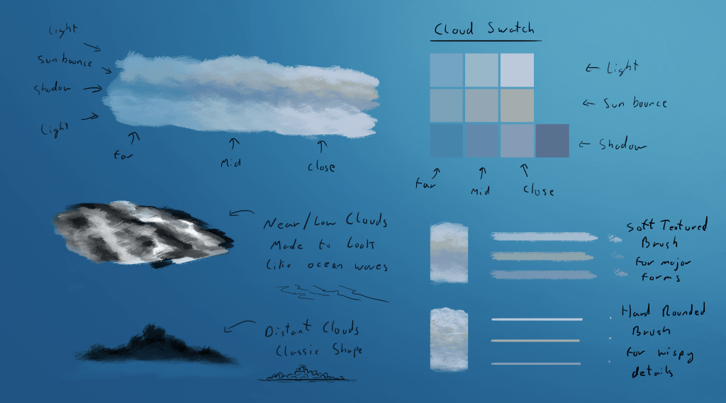
I first tackled painting in the sky and clouds, but before working on the actual piece I did some quick studies and came up with a process for painting the clouds. My goal with the clouds was to make them look like waves, as if the clouds formed this worlds equivalent of an ocean.
I then started to block in the rest of the background elements. For the rocks and cliffs I wanted them to further suggest the idea that the clouds were like an ocean so around the cliffs I added rocks sticking up through the clouds. Colour wise I wanted the rocks to be contrasting with the blue sky and to look very saturated/colourful to go with the cartoon like style but still be fairly detailed and textured.
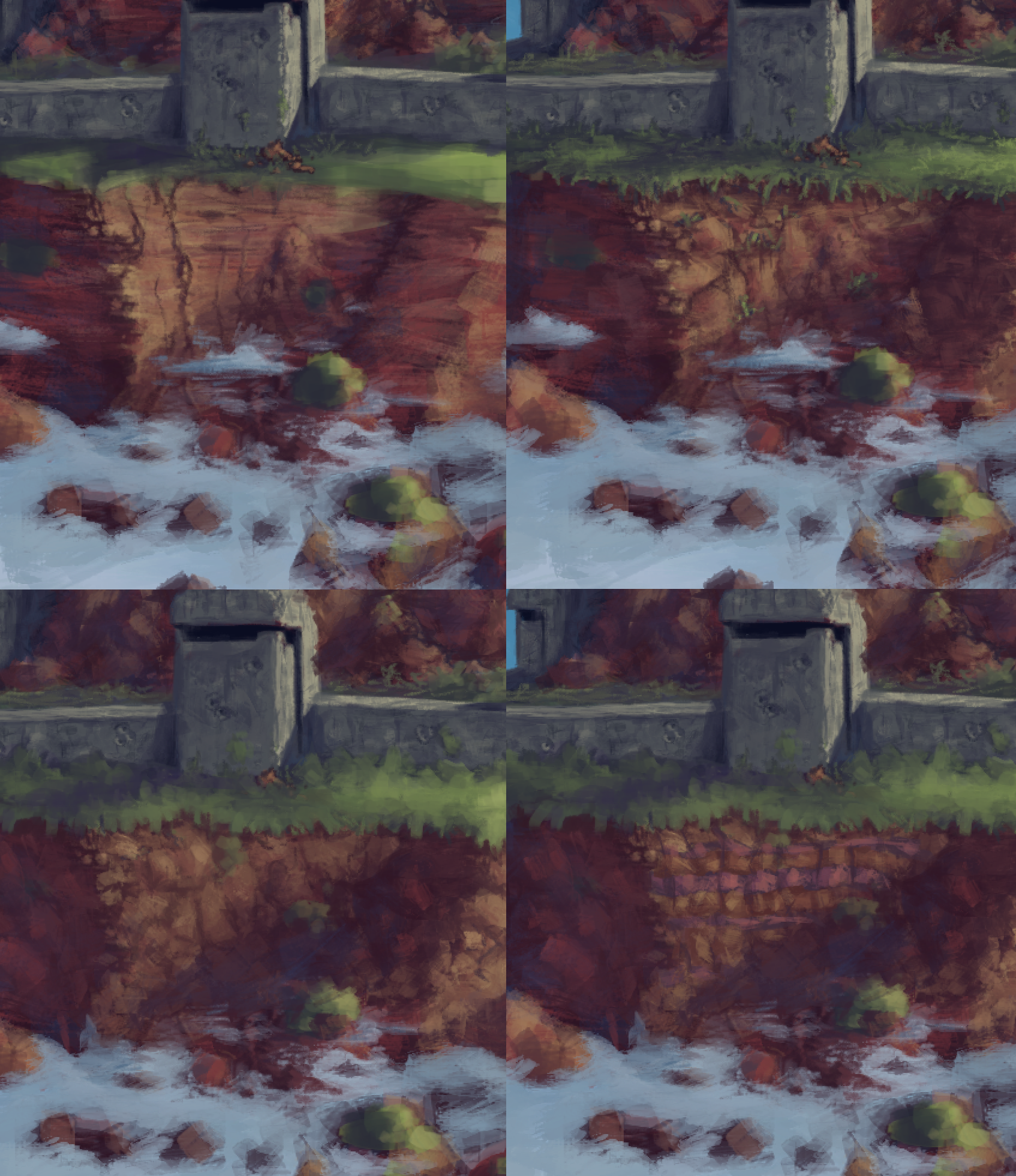
Below you can see how I experimented with different ways of painting the rock texture on the cliffs. I think it’s useful to work this way, to try out different ideas to make sure you’re picking the best one and it’s a good opportunity to get some input from the rest of the team.
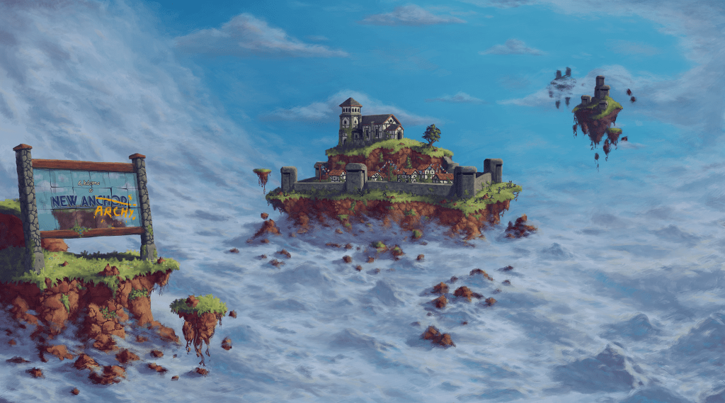
With the buildings and architecture I went for the classic idyllic village look. I felt this fit with the backstory of the game’s setting, being that it was a peaceful picturesque place up until the moment pirates and bandits started raiding the area. This would be reflected in the environment with evidence of destruction throughout the area (which isn’t shown in the concept art) as well as newer built defensive structures. For these I taken heavy inspiration from real defensive structures and bunkers used throughout the first and second world wars but with a fantasy twist that made them resemble old castle walls and turrets. These defensive structures would be a stark contrast to the older residential and civic buildings nestled behind them, showing how the recent history has affected the area and the animals that live on these floating islands.
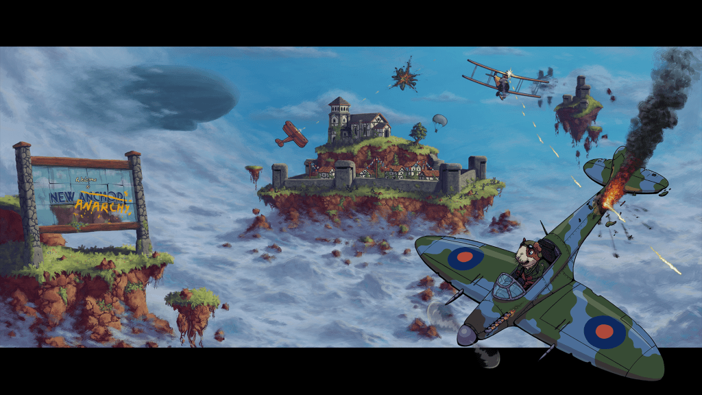
The final step was to incorporate the planes, pilots, explosions, etc. At this point I’d already done the groundwork of designing a character and narrowing down the style of foreground elements. So this step just involved doing the work to get everything drawn in. I did try a few different facial expressions for the main pilot to see what worked best, which I got feedback on from the rest of the team.
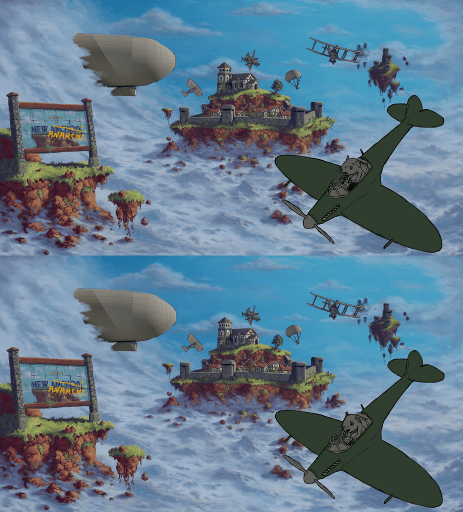
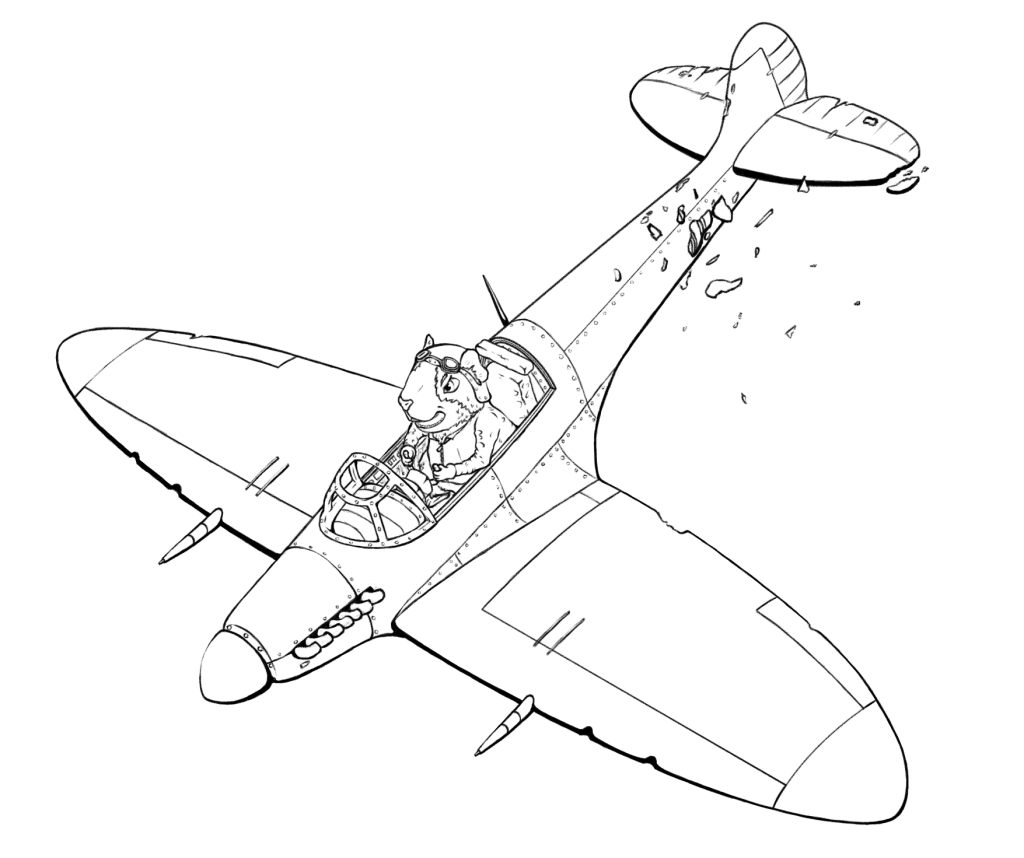
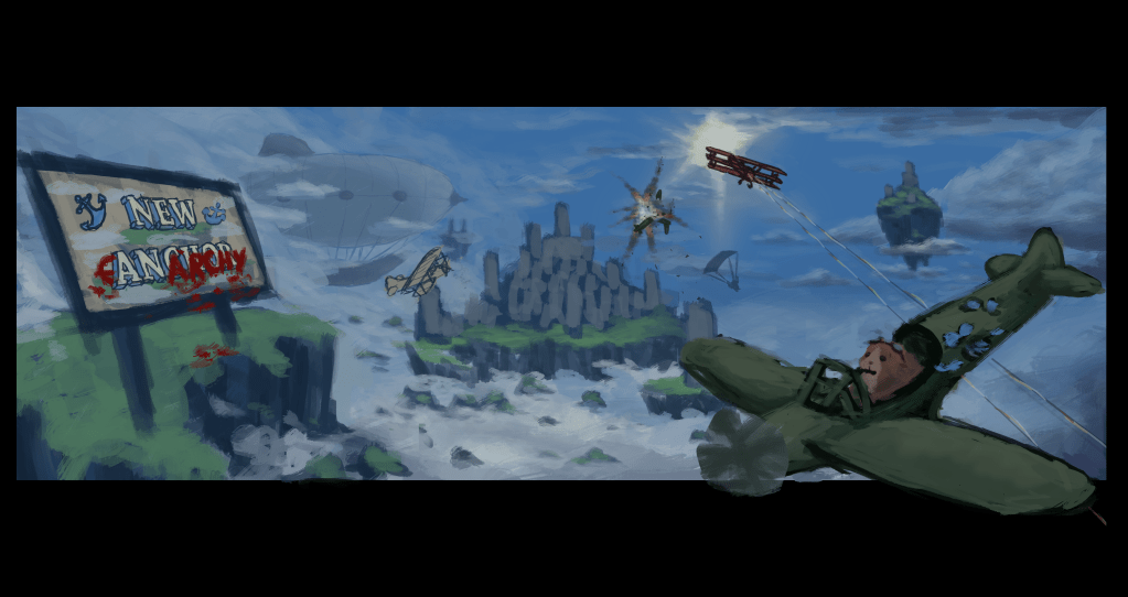
Above is the final line art for the main pilot and plane.
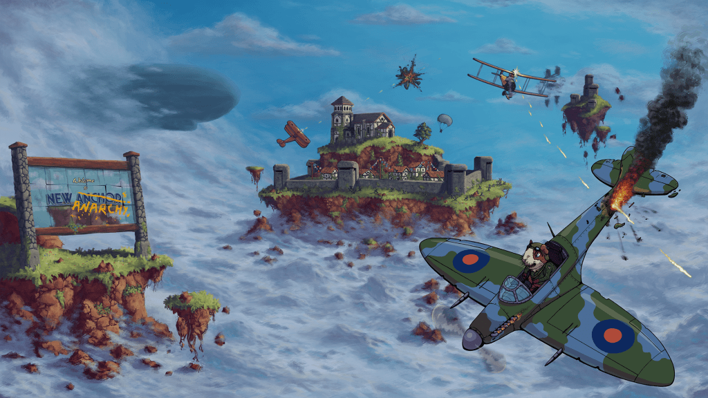
Below is the full finished piece.

I also created some quicker paint overs of 3D blockouts provided by one of the 3D artists on the team. This helped with demonstrating what these environments could eventually look like in game. As well as providing a reference of what the 3D artists on the team should aim for as we fleshed out the test levels.

Leave a comment